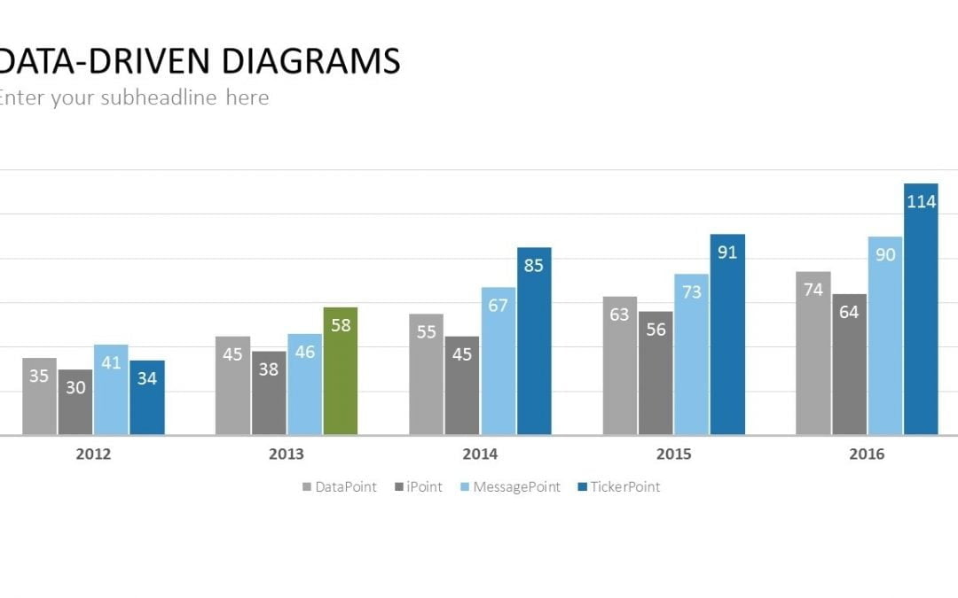
Nov 12, 2017 | DataPoint, DataPoint Automation, DataPoint Real-time Screens
Charts are great to visualize data. Look at a simple bar chart. It visualizes information and immediately plots the information on an X and Y axis. Products compared to countries, teams compared to productivity, and so on. Or a pie chart. See what part of the pie is...
Sep 25, 2017 | Articles, DataPoint, DataPoint Automation, DataPoint Real-time Screens
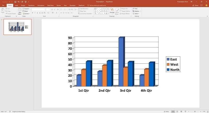
PowerPoint is great software that lets you handle all your presentations in an easy manner. It is ideal to display charts and graphs and can even be used to build dashboard software. However, if you explore this amazing software, you will find that it is not...
Oct 7, 2015 | DataPoint, DataPoint Automation, DataPoint Real-time Screens, How-To
Advantages of using charts There are many reasons to use data driven charts to visualize information in a presentation or on an information screen. First of all, charts are easy to read. Charts are visually appealing, compared to e.g. a text box or table. Easy...