In today’s data-driven world, effective data visualization has become crucial for conveying complex information in a simple and visually appealing format. PowerPoint, with its versatile features, allows users to create impactful presentations incorporating insightful visualizations. One of the powerful PowerPoint tools that PresentationPoint offers is the DataPoint plugin. In this blog article, we will dive into the best practices for designing engaging and insightful visualizations using the DataPoint plugin for PowerPoint.
Understand Your Audience and Data
Before starting the visualization process, it is essential to understand your target audience and the data you are working with. By gaining a deep understanding of their needs, preferences, and knowledge level, you can tailor your visualizations to effectively communicate the intended message.
Choose the Right Chart Type
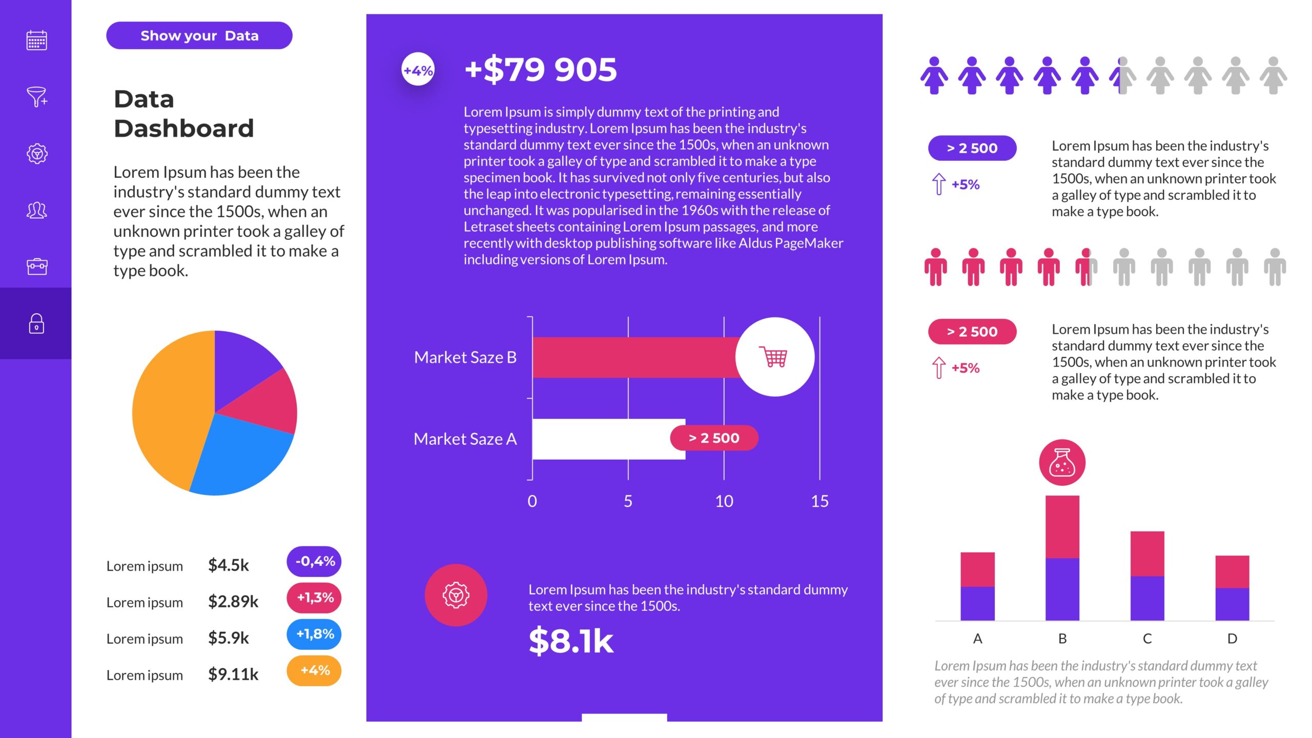
Selecting the appropriate chart type is crucial to effectively represent your data. PowerPoint’s DataPoint plugin offers automating a wide range of chart types, including bar charts, line charts, pie charts, and more. Consider the nature of your data and the story you want to convey to determine the most suitable chart type.
Simplify and Declutter
Visualizations should be visually appealing and easy to comprehend. Avoid cluttering your slides with an excessive amount of data or unnecessary graphical elements. Keep the design clean, simple, and focused on the main message. Use clear labels, legible fonts, and intuitive color schemes to enhance readability.
Utilize Interactive Features
With the DataPoint plugin, you can make your PowerPoint presentations more engaging through interactive features. Incorporate clickable elements, such as hyperlinks, buttons, or dropdown menus, to allow your audience to explore the data at their own pace. Interactivity enhances the user experience and encourages active participation.
Incorporate Relevant Annotations
Annotations help provide context and guide the audience’s understanding of the visualized data. Utilize text boxes, callouts, and arrows to highlight key insights, trends, or patterns. Use descriptive titles and captions to support the visuals and create a narrative flow throughout the presentation.
Leverage Animation and Transitions
PowerPoint’s animation and transition features can play a significant role in creating engaging visualizations. Use them strategically to reveal data points or elements gradually, drawing attention to specific areas or emphasizing important insights. However, be mindful not to overdo it, as excessive animation can be distracting.
Maintain Consistency
To create a visually cohesive presentation, establish a consistent design language across all slides. Use the same color palette, font style, and layout throughout the presentation to maintain a professional and polished appearance. Consistency aids comprehension and allows the audience to focus on the content rather than being distracted by inconsistent design elements. DataPoint will help you with consistency, every report automation will look the same.
Test and Iterate
Before presenting your visualizations, it is essential to test them with a sample audience or colleagues. Gather feedback and iterate on your designs to improve clarity and effectiveness. By incorporating different perspectives, you can identify potential areas of improvement and ensure that your visualizations meet the needs of your audience.
Conclusion
Effective data visualization through the DataPoint plugin in PowerPoint can transform dull and complex data into engaging and insightful presentations. By following the best practices discussed in this article, you can design visualizations that effectively communicate your message, engage your audience, and present your data in a visually appealing manner. Remember to understand your audience, choose the right chart type, simplify the design, utilize interactive features, incorporate relevant annotations, leverage animation, maintain consistency, and test and iterate for optimal results. Happy visualizing!
We hope you found this blog article valuable and that it inspires you to create engaging and insightful visualizations using the DataPoint plugin for PowerPoint. Go ahead and unleash your creativity to make your data visuals truly impactful!