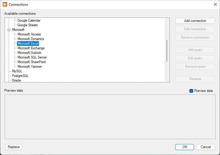
Recently I was asked by a customer if DataPoint can show thematic maps, colored by data. A thematic map is a type of map that portrays the geographic pattern of a particular subject matter in a geographic area or shape. Of course, the answer was yes, but you need to apply a trick to make it work. Setting the fill color of given hand-drawn shapes was an obvious idea, but that is not possible (yet). So I came up with this solution. Follow me.
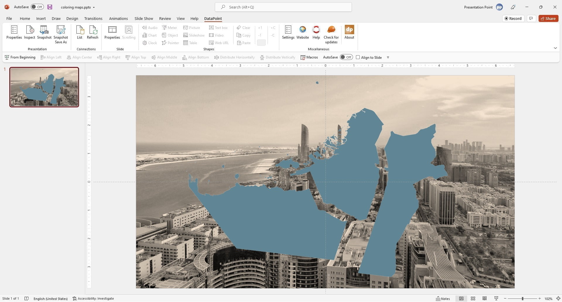
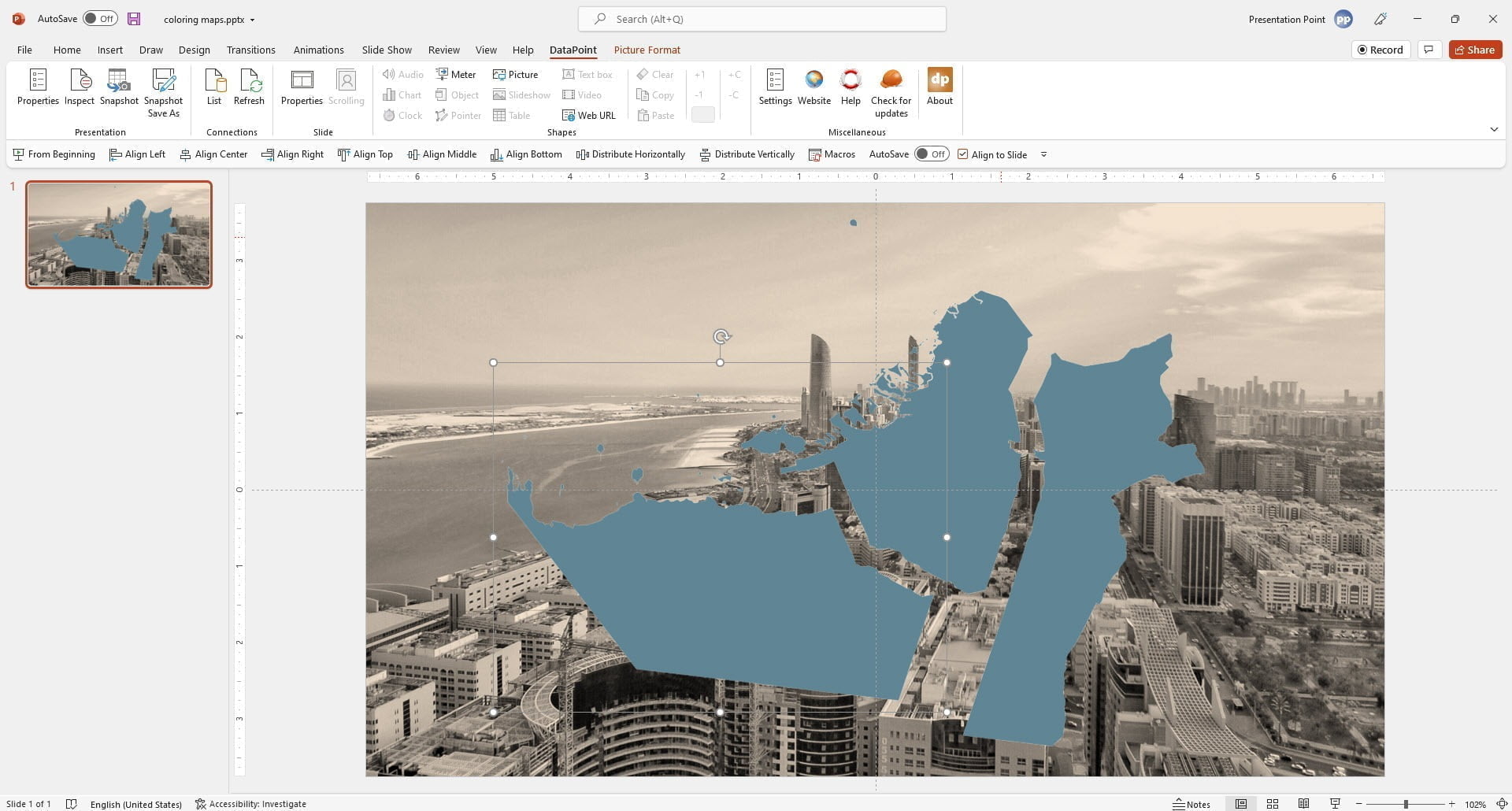
Start with a new presentation like this below. Add a background image and draw the 3 areas or maps on your slide. We start by inserting the maps with whatever fill color.
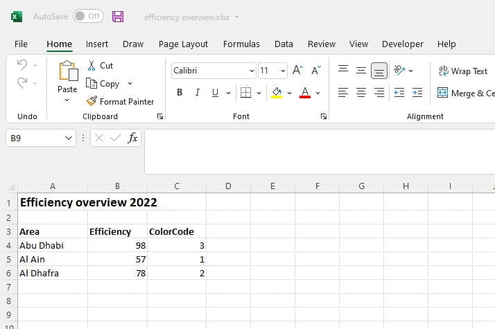
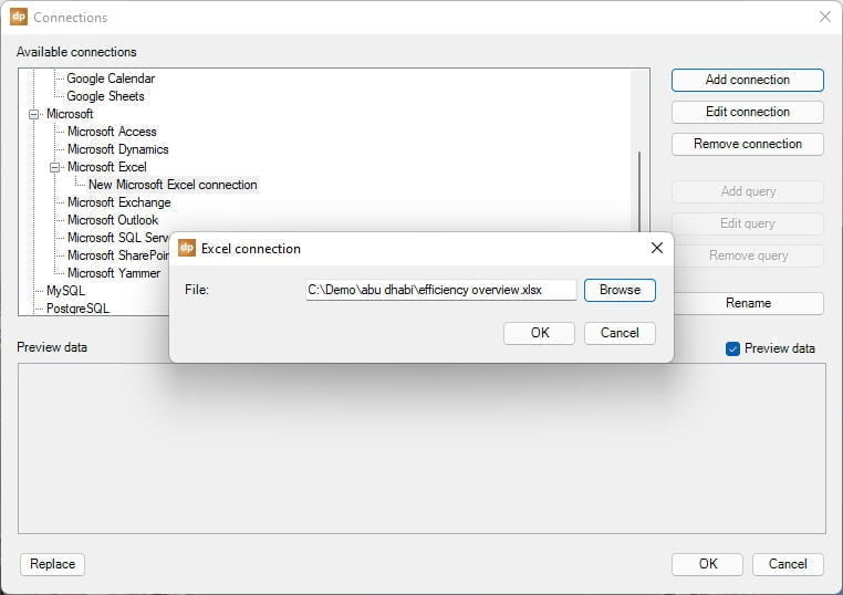
Then we have the data stored in an Excel file for this example. With DataPoint you can connect to any data source and get the information from there. In the datasheet, we can find the name of the map, then the value that we want to show, and a calculated field.
We want to color the maps in color A when the value is smaller than 60. Fill it with color B when the value is between 60 and 80, and set the fill color to C when the value is 80 or more.
The calculated field holds this formula:
=IF(B4<60,1, IF(B4<80,2,3))
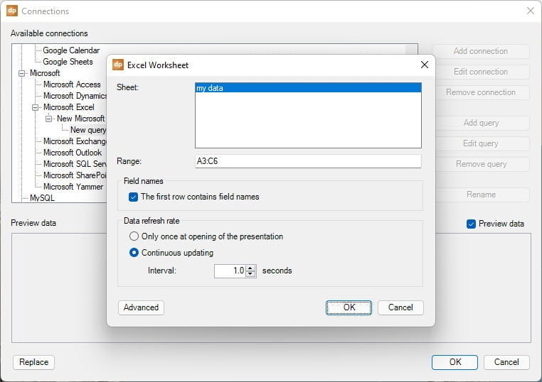
So the IF function is used twice to calculate first if a value is lower than 60. Then we check if the value is smaller than 80, and otherwise the value is 80 or higher. All possible values are covered. Copy down this formula to every line of data. The result is that this calculated field will hold values 1, 2, or 3.
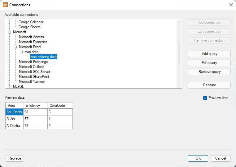
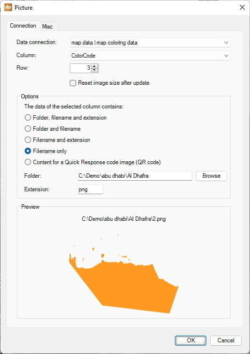
At data, the connection selects the data query that you want to use from the list. Since we have set up only 1 query to the Excel file, will we only have 1 entry.
Then select the column ColorCode which is our calculated field holding values 1, 2, and 3 only.
At the preview pane, you can see the filename of the picture that is constructed, but that is not yet valid at this moment.
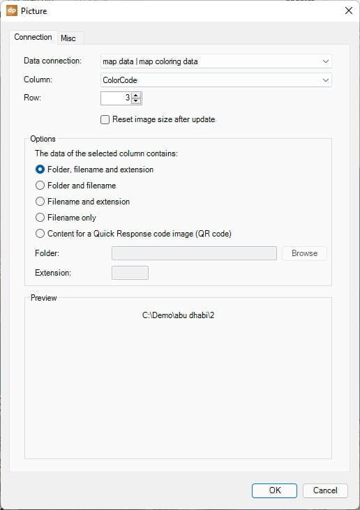
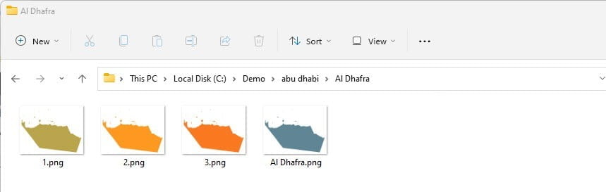
Set the folder to the folder where we have all images of this map holding all color variations. And set extension to PNG as that is the file extension of the images that we are using here.
Now you will see a better and valid filename as we now have C:\Demo\Abu Dhabi\Al Dhafra\2.png. And this one is valid because we see the corresponding picture there. Hit OK to close and bind this shape to the color code value from Excel.