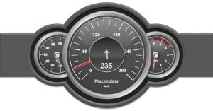
 Dashboards are great to visualize information. Think about the dashboard in a car. The speedometer there immediately gives a graphical indication of the speed. In a glance the user will see if driving too fast.
Link for dynamic data
The user can create similar digital dashboards to visualize the sales or production figures. Create an information screen or notice board with a speedometer or gauge in a Microsoft PowerPoint presentation and link it to an Excel file or database for real-time updating. As soon as a new order is added to the sales database, the gauge will update accordingly.
We use DataPoint to connect information screens to data sources. The user can use an Excel file or various database types to store the data. To learn how the user can connect to Excel read this article. For database linking refer to this article. Finally the user end up with a data table with information that the user wants to show on the information screens.
Self-rotating needle
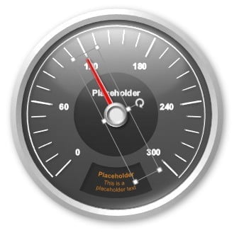
Let me show how the user can use a gauge or meter and update the needle at runtime. First I create or open a presentation with a gauge. Then I select the needle of the gauge only.


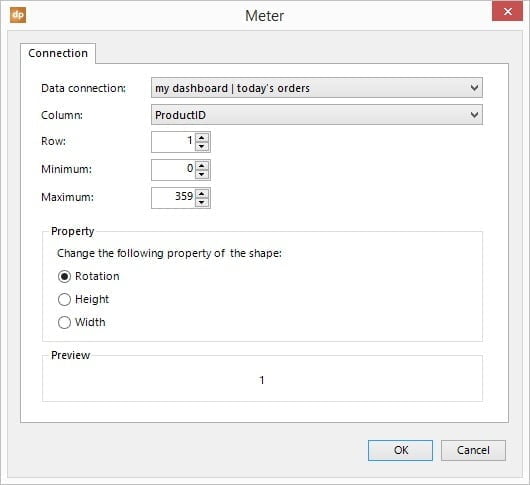
To catch extreme values of the database, the user can set a minimum physical value and a maximum value. When the highest possible value of the gauge is 100 and the user would have an exceptional database value of 120, then the user can set the maximum physical value to 100 to indicate that the meter has reached the top and will not rotate further than the maximum value of the gauge. At this situation, the car is already driving the maximum speed.
Other dynamic dashboard shapes
But sometimes the user don’t want to use needles and rotations. Now, the user can create a meter with a slider or thermometer to indicate the value like in this screenshot.


It’s really helpful.