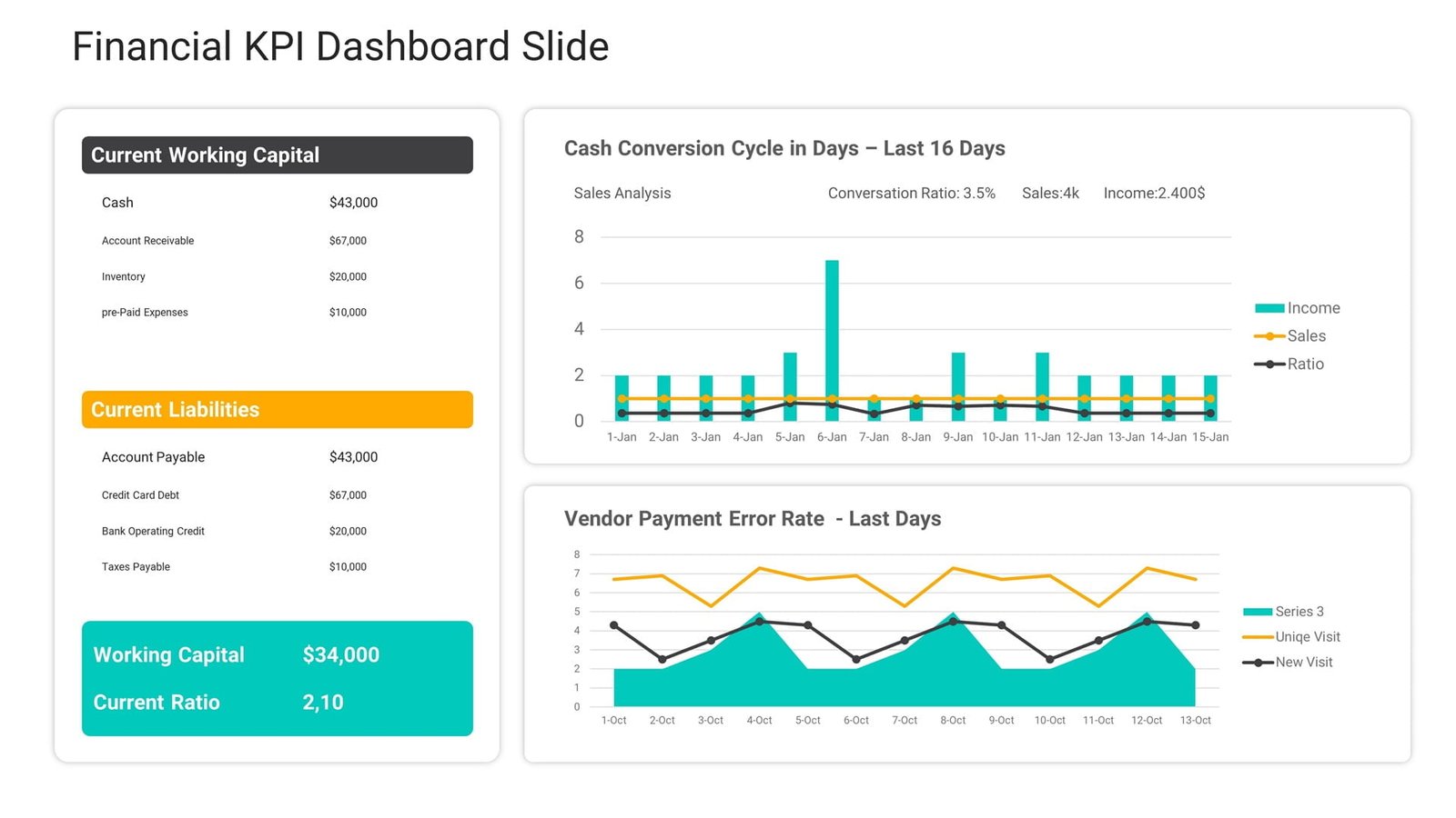
In today’s data-driven world, effective communication of information is key to success. With the rise of big data, businesses and organizations are inundated with information that needs to be analyzed and presented in a clear and concise manner to make informed decisions. This is where DataPoint plugin for PowerPoint comes in.
DataPoint is a powerful PowerPoint add-in that enables users to seamlessly integrate real-time information and dynamic data feeds into their presentations without the need for any coding or programming knowledge. With DataPoint, you can easily create compelling data visualizations, charts, graphs, and dashboards that make complex information more accessible and understandable.

Here’s a step-by-step guide to using DataPoint to create effective data presentations that are sure to impress your audience:
Step 1: Install DataPoint plugin for PowerPoint
First, you need to install DataPoint plugin for PowerPoint on your device. Once installed, open PowerPoint and you’ll see the DataPoint tab on the ribbon.
Step 2: Connect to your data source
After opening PowerPoint, click on the DataPoint tab and select ‘List Connections’ to connect to your data source. DataPoint supports a wide range of data sources, including Microsoft Excel, SQL Server, MySQL, Oracle, Salesforce, and more.
Step 3: Select your data and create a query
Once you’ve connected to your data source, you need to select the data that you want to include in your presentation. Simply create a query by selecting the table or range that contains your data and specify the fields that you want to include in your presentation.
Step 4: Update your presentation
Now you’re ready to create your data visualization. To add your data into your presentation, select the objector shape in your slide where you want the data to be displayed, for example, a graph or chart. Then, in the DataPoint tab, select the query that you want to use for your object. DataPoint will automatically create a dynamic link between your object and data source which allows your data to be updated in real-time.
Step 5: Customize your data visualizations
To make your data visualizations more engaging and impactful, you can customize the design of your objects. DataPoint offers a range of customizations, from chart types to colors and fonts, that you can use to make your presentation visually appealing and consistent with your branding.
Step 6: Present and update your data
Finally, you’re ready to present your data. Once in ‘presentation mode’, your shapes will update automatically as they pull live data from your chosen data source. You can even enable an automatic refresh interval for your presentation to ensure that your data is always up-to-date.
In conclusion, DataPoint plugin for PowerPoint is an essential tool for creating powerful and engaging data presentations. Whether you’re presenting to shareholders, clients, or colleagues, DataPoint transforms mundane data into visual masterpieces that captivate your audience and make your data understandable and informative. With a few easy steps, you’ll be able to create dynamic, real-time data visualizations that will set you apart from the competition.
Get Started with DataPoint Today!
Download your free trial


