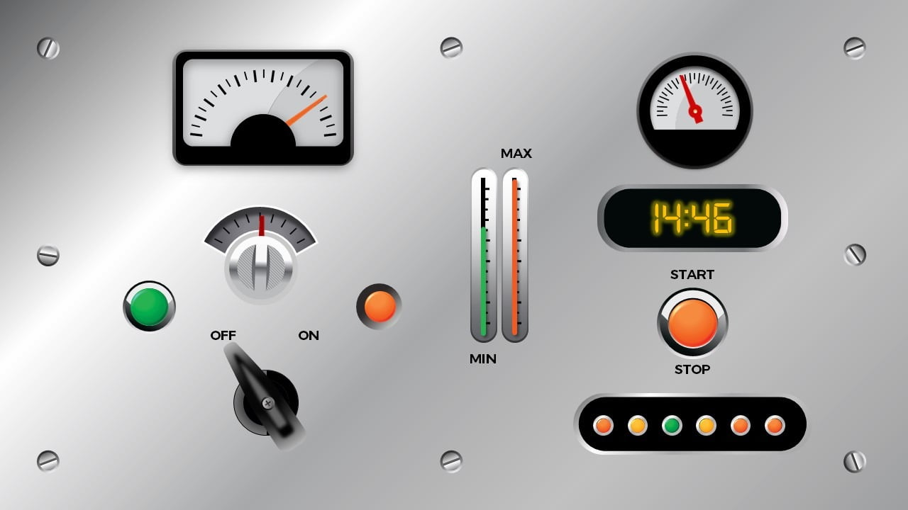
We recently created this data-driven dashboard in PowerPoint by connecting our presentation to a database with our DataPoint plugin. The result is quite astonishing. The database is basically a dummy, where we have a small utility to execute random updates on the data. If you are working for a big company or a big factory, then you probably already have data that are updated extensively. So here we are simulating updates on the data.
First of all, we have drawn some nice-looking meters and gauges and lights on a slide.
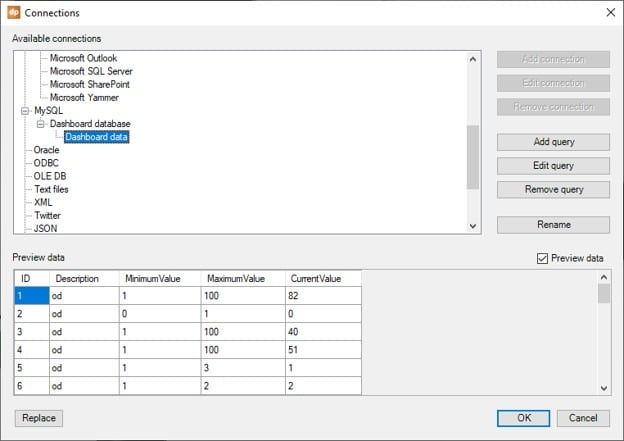
Then we have used DataPoint to connect the presentation to a database and set up a query that refreshes every second.
On-Off Switches on a Dashboard
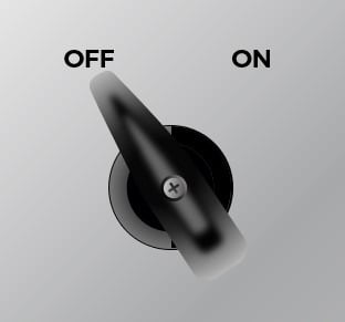
We started to link every element of this database. Let’s start with that large On/Off switch. This is drawn in PowerPoint by just drawing some shapes and then merging it into one shape, so that we have that switch. Added 2 text boxes with the text Off and On.
We rotate the switch on the Off position. Then we go into the DataPoint meter options and link it to a specific row of the query, where we know that a random value of 0 or 1 is being generated.
We set the connection, choose the column and set the row number. At the Property pane, we set it to control the rotation. Then at the rotation properties, we set the value to range from 0 to 1. And we click the ‘Use current rotation of shape as minimum rotation’. Hit OK.
Then we rotate the switch to the On position. Go into the meter properties again and now click the ‘use current rotation of shape as maximum rotation’. Hit OK again to save.
That is all we need to do. Run the slideshow. DataPoint will requery the database every second, and move the switch into the corresponding position; 0 or 1, off or on.
Dashboard with Data-Driven Gauges
Let’s do something more complex. This gauge.
We have 2 images on top of each other like so.
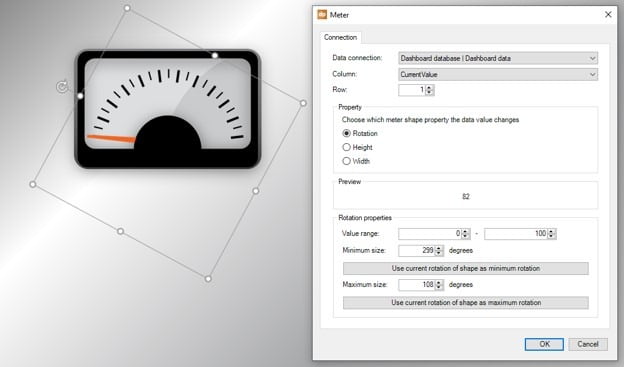
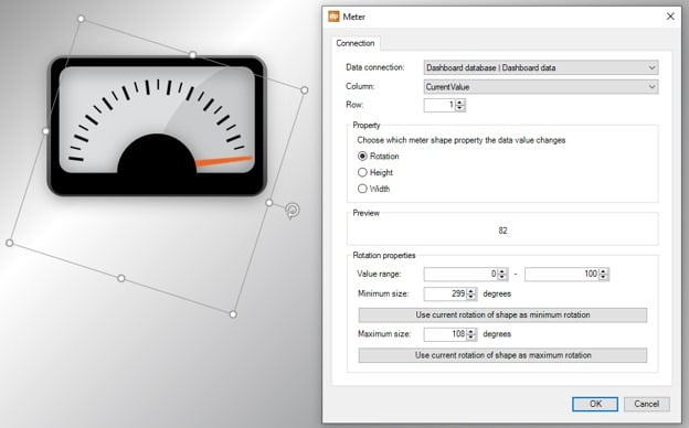
One is just the background. And that orange needle is again the shape that we are going to rotate. Turn the needle to the left, the minimum position and go into DataPoint meter option here again.
Assign it to the results of the first row. Choose to control rotation. Set the minimum value to 0, maximum to 100 and click the ‘use current rotation of shape as minimum rotation again. Hit OK to close.
Rotate the needle to maximize and open the meter properties.
Click the ‘use current rotation of shape as maximum rotation’. Hit OK and we are ready to show this needle dynamically in slide show mode. Now you can see it repositioning smoothly to the new location.
Dynamic Light Indicators
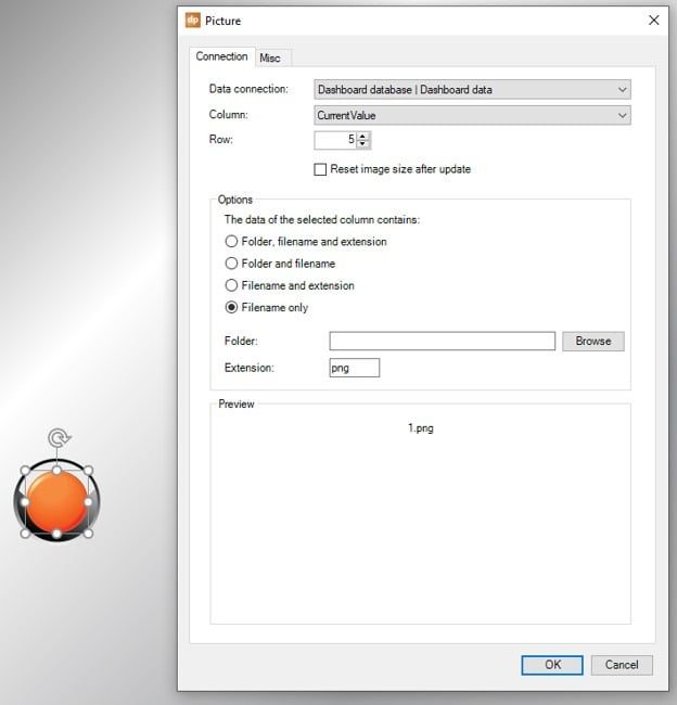
Look at the different lights that we use to express a given status or database value. For this, we have 3 images in a folder. Insert any of them on your slide, and open the picture properties of DataPoint.
We assign this to row number 5. We know that it is producing a value of 1, 2 or 3. We have 3 images in folder like so:
So when we bind and use dynamically, the current value of 1 in our database, will set the source of this linked image to 1.png, so the green light. Hit OK to get this done.
Data-Driven Thermometers on your Dashboard
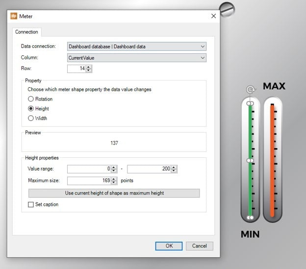
Finally some thermometers that we are going to change the value dynamically. 2 shapes here again. 1 for the thermometer background, and 1 shape (here a rectangle with rounded corners) placed on top of the thermometer shape or image.
In contradiction with the rotating shapes earlier, we first set the thermometer fluid to its maximum. Then we open the meter options of DataPoint again.
Link it to row 14 of our database (we know that we have to visualize row number 14 because we know our factory database). Set the action property to control the height. Then set the value range to 0 and 200, and click the ‘use current height of shape as maximum height’.
Data-Driven PowerPoint Dashboard
That is all we need to do. Let the values in your database change and run your slide show. The output on your screen would be something like this.

