In this video, we show you how to create a live coronavirus dashboard using PowerPoint and the PowerPoint add-on, DataPoint. Then we break down some of the steps and show how-to screenshots in the article.
Find A Coronavirus Dashboard Data Feed
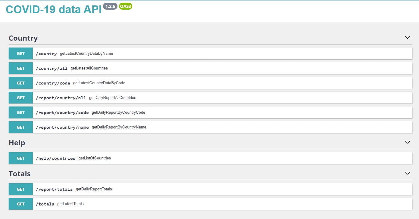
The first step is to find a live data feed for our Coronavirus dashboard. PresentationPoint has gathered a number of useful live data feeds here in our data feed directory that you can access. From our curated list, I found this Covid-19 Data API.
Create Dashboard Connection
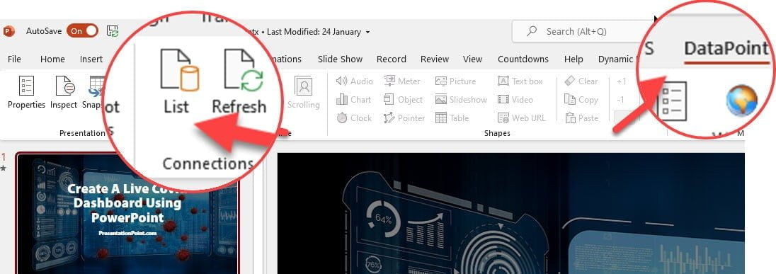
The next step is to create our PowerPoint presentation and connect our presentation to the Covid-19 API above. We do this by clicking on the [DataPoint] option in our PowerPoint tool ribbon, then clicking on [List]. If you do not have DataPoint installed on your PowerPoint software, you can download DataPoint here.
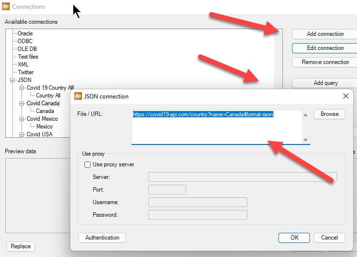
The next step is to choose [Add Connection] from the list command area. In this case you choose JSON as the feed format and add your API feed url.
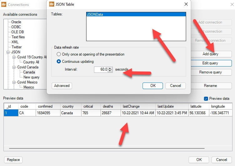
Now that you have your connection, click on [Add Query] then choose JSON data and set the refresh rate. You will see the data table showing in the Preview area.
Now that we have our live coronavirus dashboard connection, the next step is to add the data to the PowerPoint.
Create a PowerPoint slide and then insert text boxes for the country labels and the data numbers using the standard PowerPoint insert text box command. Then click on the text box you have added and click on the [DataPoint] tab at the top of the menu ribbon and then click on [text box].
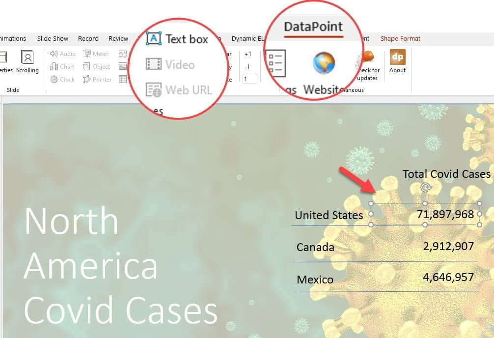
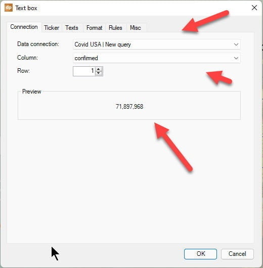
Once you click on these options a dialog box will show up showing you your data options. You choose the connections you want and you will see the data returned in the preview. You can also use the tabs on the top of the dialog box to set up data rules, formatting, etc.
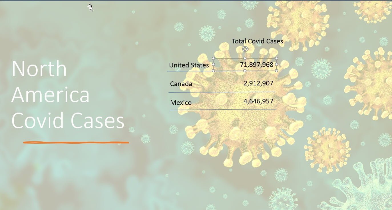
When completed, you will have a text box layout that looks like this. You can, of course, add graphics to make the slide more visually pleasing, and the data will update automatically.
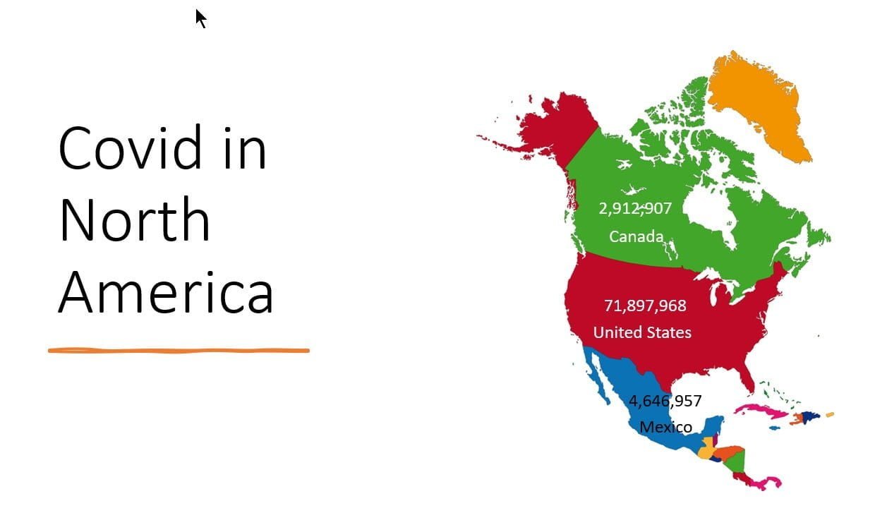
As an alternative, you could add a live coronavirus dashboard as a map. This is done exactly the same way as the previous slide, just with the text boxes added to a map in the appropriate places.
Note that you can change font size, color, etc. using normal PowerPoint commands and this only affects the look of the data. The numbers are still live updating.
We hope you found this article and video of use. If you have any questions about setting up your own live data dashboard, please contact us.