A surprising message from Microsoft recently. Microsoft is going to replace its default font. Originally it started with Times New Roman and with Office 2007 it switched to the current Calibri font which was the default font for the last 15 years.
Now Microsoft is gratifying its search for the next default font. They released 5 font candidates publicly. As of now, they are available on your list of fonts already at your Microsoft 365 apps. They ask us to vote for your favorite font. Don’t worry if the font that you prefer, is not chosen. All 5 fonts will be available in the next version of Office, next to Calibri, and the other fonts that you use.
And the New Names are:
These are the names of the 5 new fonts:
- Bierstadt
- Grandview
- Seaford
- Skeena
- Tenorite
Let’s have a look at the current default font, and at the 5 new options.
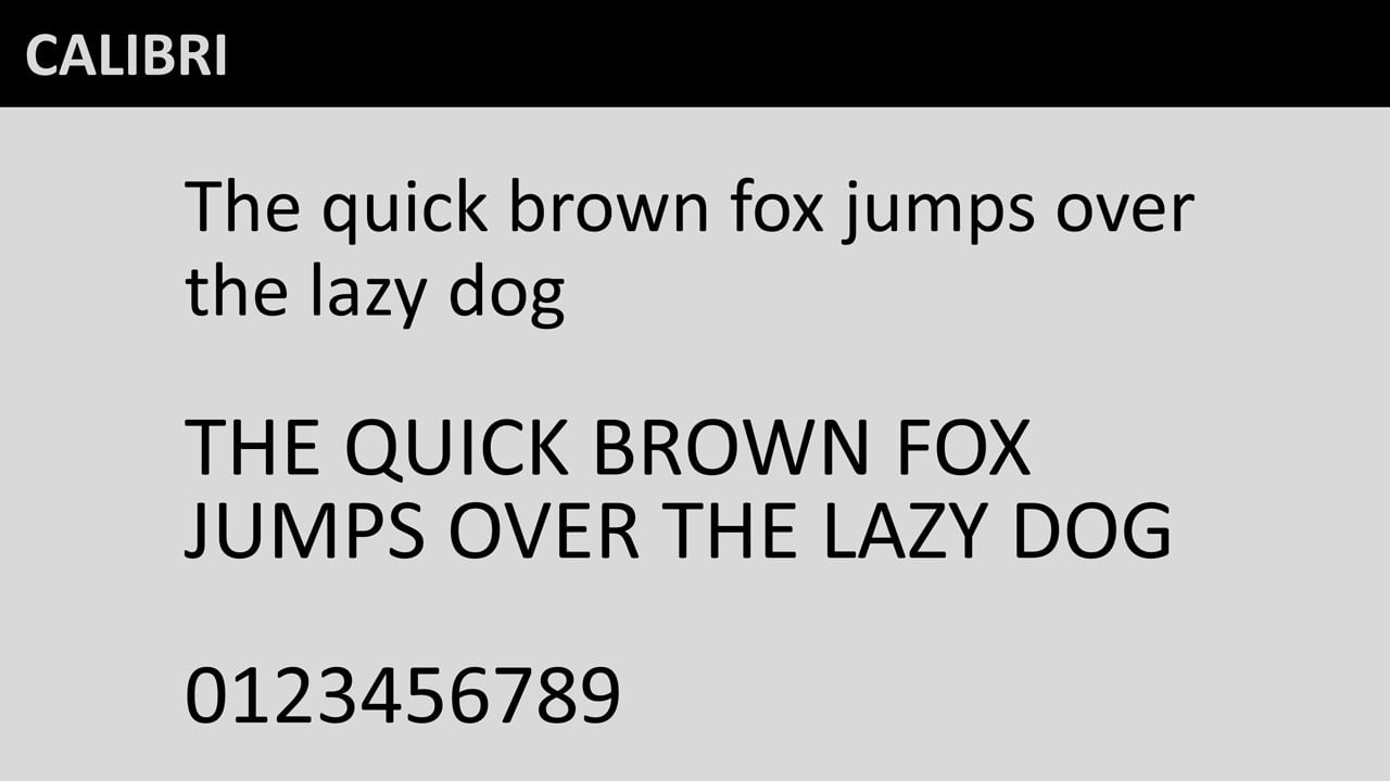
CALIBRI: the Current Default Font
Once more, this is the current default Office font named Calibri. It was present since Office 2007 till soon.
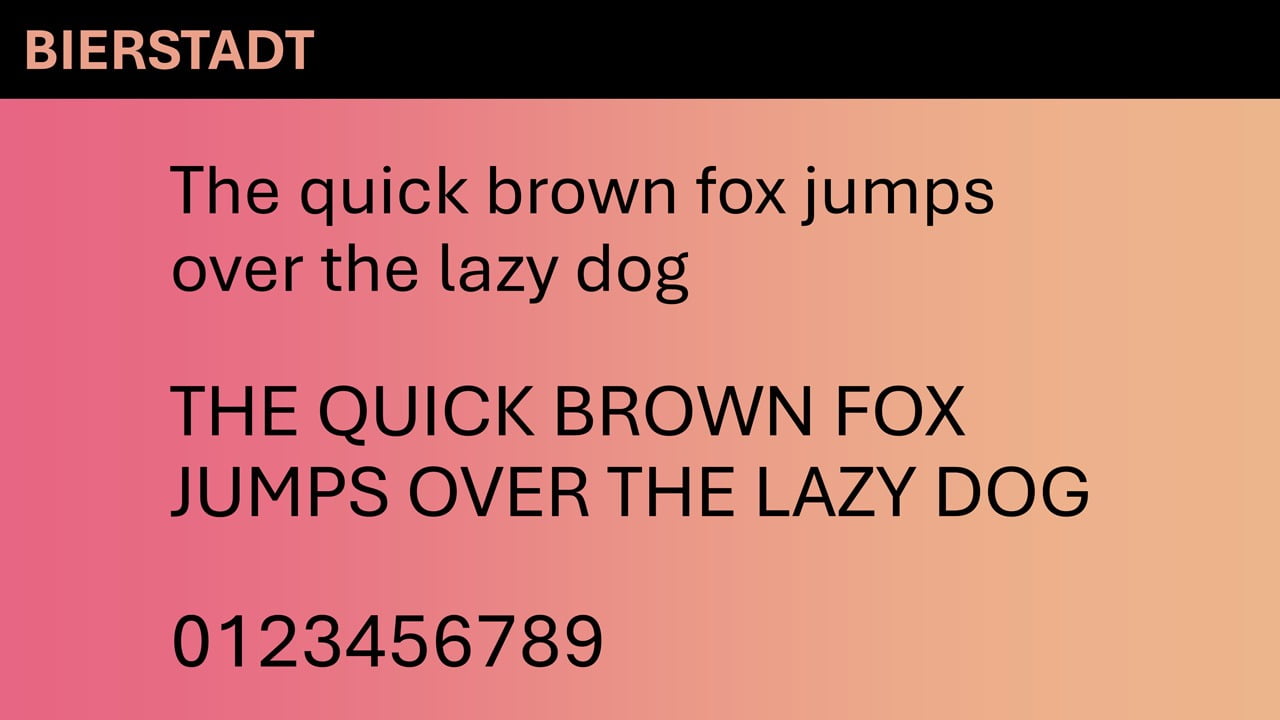
BIERSTADT by Steve Matteson
Bierstadt is a precise, contemporary sans serif typeface inspired by mid-20th-century Swiss typography. A versatile typeface that expresses simplicity and rationality in a highly readable form, Bierstadt is also notably clear-cut with stroke endings that emphasize order and restraint.
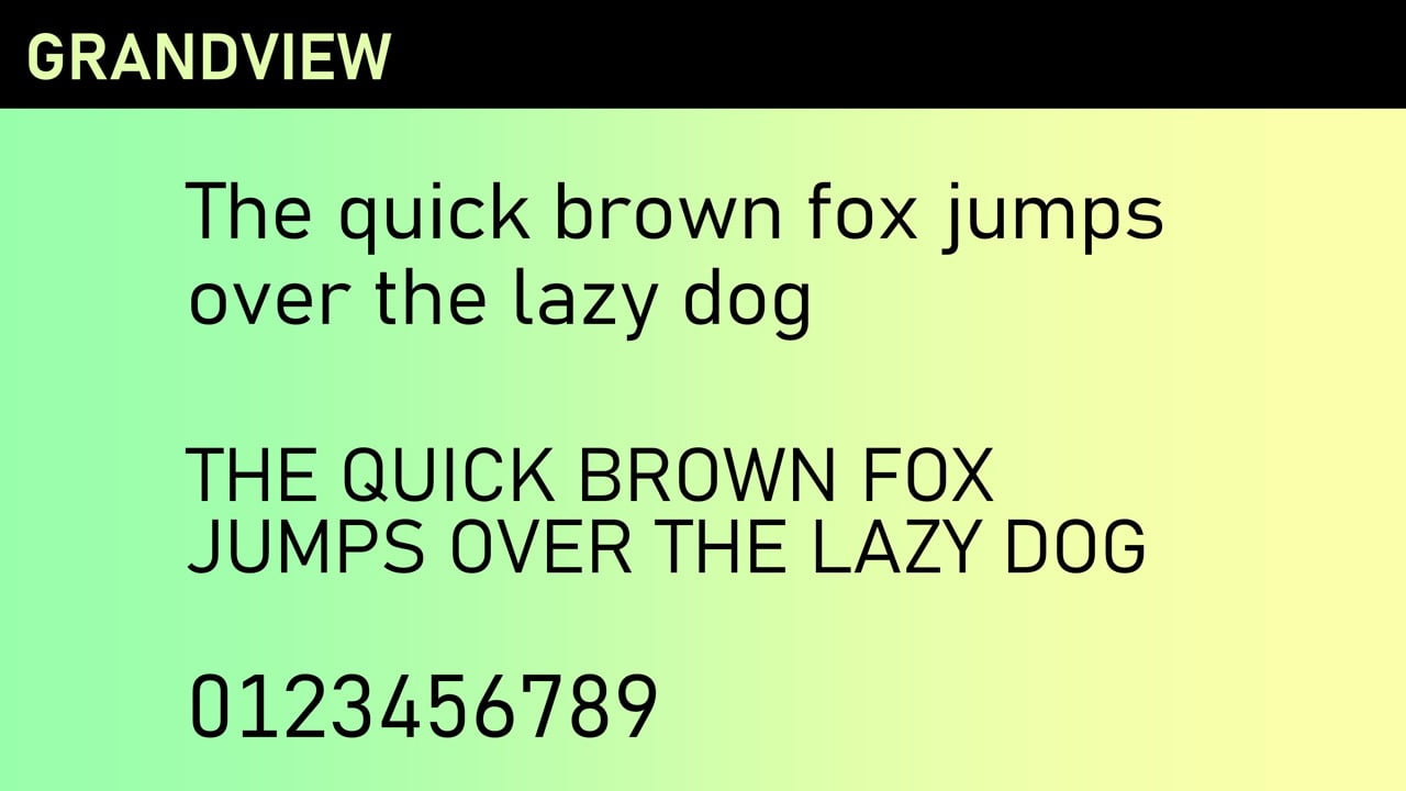
GRANDVIEW by Aaron Bell
Grandview is a sans serif typeface derived from classic German road and railway signage, which was designed to be legible at a distance and under poor conditions. Grandview is designed for use in body text but retains the same qualities of high legibility, with subtle adjustments made for long-form reading.
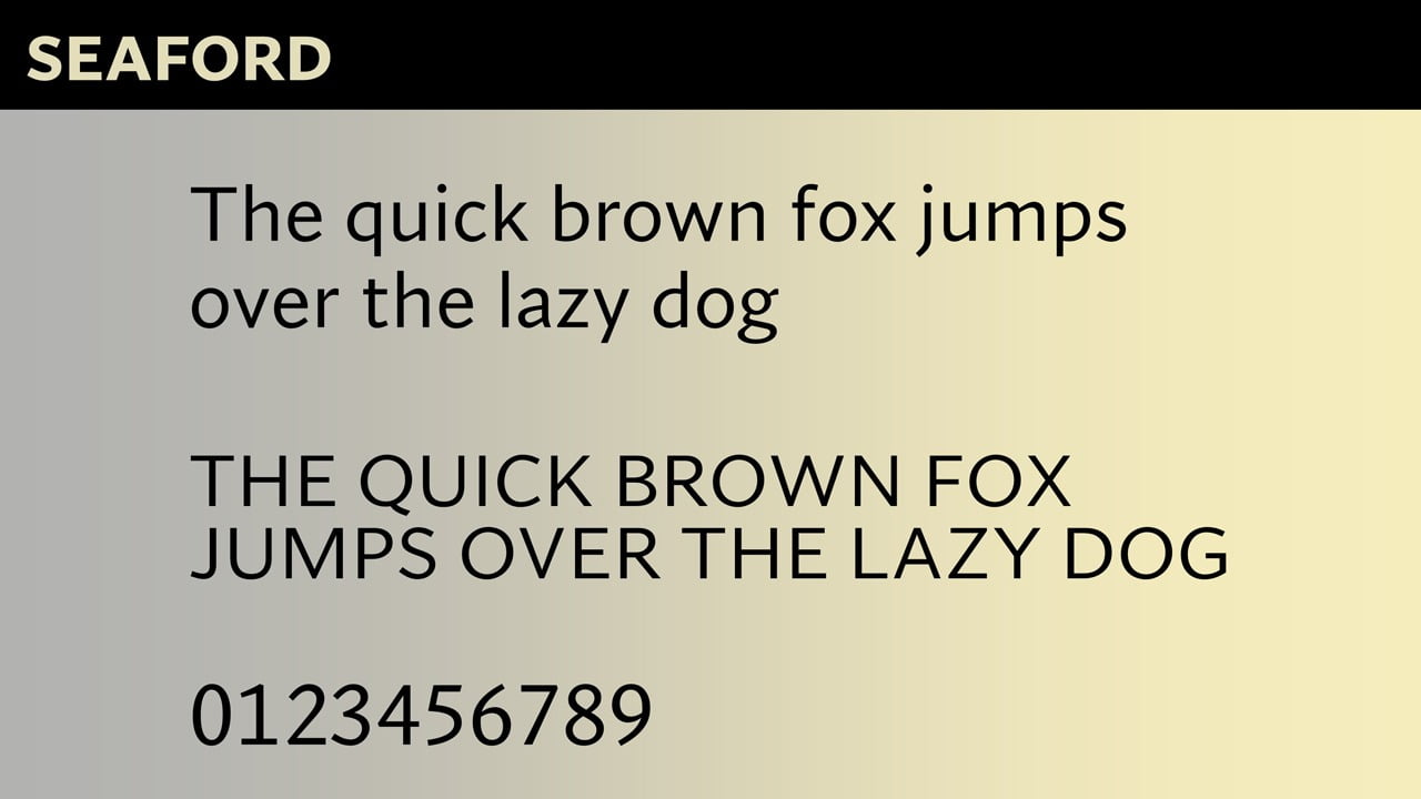
SEAFORD by Tobias Frere-Jones, Nina Stössinger, and Fred Shallcrass
Seaford is a sans serif typeface that is rooted in the design of old-style serif text typefaces and evokes their comfortable familiarity. Its gently organic and asymmetric forms help reading by emphasizing the differences between letters, thus creating more recognizable word shapes.
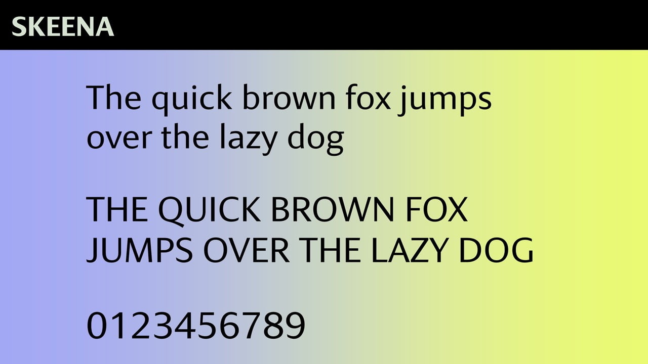
SKEENA by John Hudson and Paul Hanslow
Skeena is a “humanist” sans serif based on the shapes of traditional serif text typefaces. Its strokes are modulated, with a noticeable contrast between thick and thin and a distinctive slice applied to the ends of many of the strokes. Skeena is ideal for body text in long documents, as well as in shorter passages often found in presentations, brochures, tables, and reports.
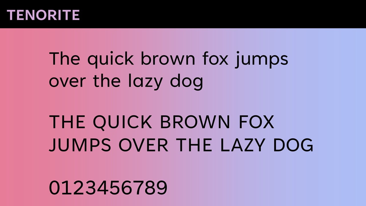
TENORITE by Erin McLaughlin and Wei Huang
Tenorite has the overall look of a traditional workhorse sans serif (a font without a serif, or a stroke at the ends, like Times New Roman), but with a warmer, more friendly style. Elements such as large dots, accents, and punctuation make Tenorite comfortable to read at small sizes onscreen, and crisp-looking shapes and wide characters create a generally open feeling.
How to Use the New Fonts?
The 5 new fonts are available already at your Microsoft 365 apps. Start your favorite Office app and look for the new font names. You will see a cloud icon next to the names. That means that they are cloud fonts and that they can be downloaded and installed upon request. Click the font name and start using it immediately.

Vote for your Favorite Default Font
Microsoft is asking everyone to vote and comment on the next default font that they are going to use for the next 15 (?) years in Office. Let’s do that! You can be part of PowerPoint/Office and at least influence their choice for the next default Windows font. Do that here.
What’s your favorite font?


Skeena
Tenorite!
SKEENA is interesting without being distracting. Its best feature is the slightly oval o’s and the slightly narrow bowls on b, d, p, and q, which facilitate reading. In contrast, Tenorite’s round o’s and the round bowls b, d, p, and q will be inhibit easy reading. Tenorite is fine for large display text, but squint a bit at a few paragraphs in 10- or 12-point type, and you will see a mass of circles. Not reader friendly. SKEENA provides both interest and readability.
Thanks Elaine for your comments!
There is one issue with the Skeena and Bierstadt, they do not have full coverage for polish diacritic characters 🙁 Only one character works, the rest is not supported.
That is weird. Maybe Microsoft is still working on that.
The numbers in Grandview remind me of the Staedtler stencils/lettering guides I used with drawing pens and drawing boards in the 1980s. I would avoid Grandview and Seaford and stick with Calibri.
Tenorite.
Bierstadt
Tenorite!
I think Calibri is still better than most of the choices. As it works well for many of the different moods that one faces during the day, week, month, and year. If you must change for the sake of changing then go with Bierstadt.
Definitely Bierstadt! The word “beer” is in it.
For number of words per line – Calibri, all the others have too few words per line.
For best letter shape – Tenorite, I really hate the antique shapes of a and g in the other fonts.
For best readability – Bierstadt, I whitened the background and that was the easiest to read.
So, Microsoft, you haven’t found a good one yet.
Definitely Skeena! It is the far most fresh, sexy and youngish, as well as earnest,
sublime, strong, the easiest to read and likable to the eye.
Skeena, Tenorite and Seaford must be disqualified because they do not solve the upper-case i/lower-case L problem. Bierstadt and Grandview do solve it by hinting at a vestigial serif at the bottom of the lower-case L.
Typefaces, not fonts.
I’ll get my coat.
Love these – I’ve always had a grudge against Calibri (really not sure why, I just never liked it since I set eyes on it). I’ve switched to Bierstadt as default in Word and Grandview as default in Excel. Grandview in spreadsheets is in fact just lovely.
Tenorite. It would be perfect with the vestigial serif on the lower-case L and the small bars on the upper-case i.
To replace Calibri, in order of preference, is (1st) Bierstadt, (2nd) Skeena, (3rd) Grandview, (4th) Seaford, and (5th) Tenorite.
Grandview
Bierstadt because it isn’t ambiguous for upper-case i versus lower case L (here I inverted the case of I/i and L/l, otherwise, as you can see, they are almost indistinguishable). Grandview is ok for that, but make upper-case o and zero (O/0) ambigous because of the flat borders of the upper-case o.
Tenorite! I am in love with this font and since I have adopted it’s use for EVERYTHING at work, it’s started to catch on with my teammates. If only it was available for use in OneNote 🙁
As the definitive choice for Bierstadt aka Aptos is made now, I can accept that.
From my point of view, the greatest downside compared to Calibri is that changing the font to bold doesn’t cause the letters to take up more space in width. The readability, especially if “j” follows “i” or vice versa is rather bad. And like David Paterson had mentioned, I also don’t like the antique shapes of “a” and g”. Therefore, I would have preferred Skeena (for bold) or Tenorite (for the shapes).
I love Tenorite, but there’s a huge problem with it displaying in Excel spreadsheets at certain sizes and at certain zoom levels, numbers even if adjusted to the right look like they are in the middle or cut from one side.