Elections are a great time for people who love data. In this video and article, we will show you some different ways to show US elections polls data in PowerPoint.
Step 1: Assemble US Elections Poll Data
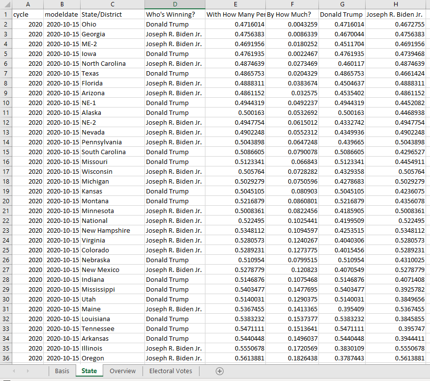
The first step is to assemble the data. I found some US Elections Poll data and simulations at FiveThirtyEight that I used for the purpose of this demonstration. The data was downloaded into an excel spreadsheet.
Step 2: Create Your Story in PowerPoint
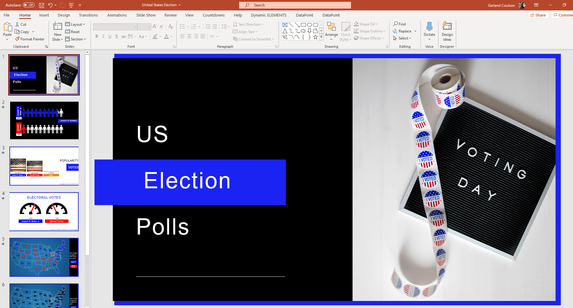
The next step is to craft the story you want the US elections poll data to tell. Create slides with the wording to show what the numbers really mean.
Step 3: Connect Your Data to PowerPoint
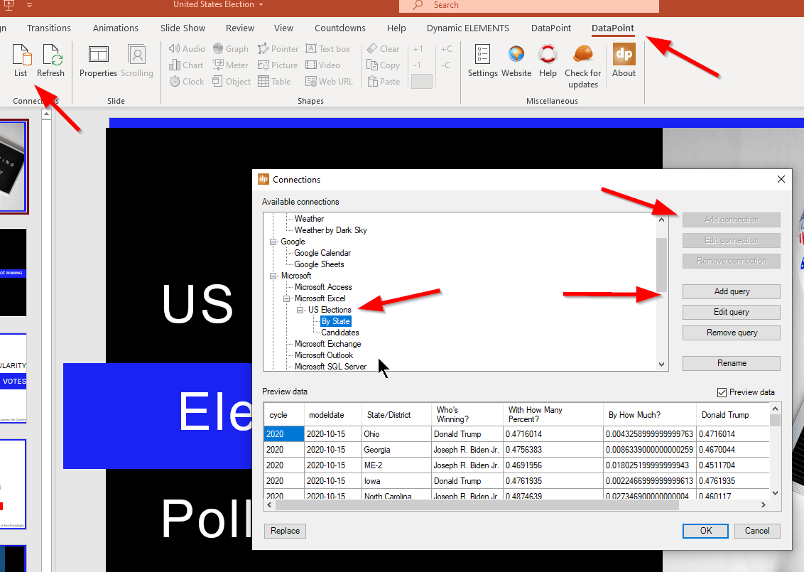
Now that we have collected our data and created our story, we need to create a connection between our PowerPoint story and the data in the excel spreadsheet. To do this, we use the [List] command on the DataPoint ribbon, scroll to the Excel spreadsheet option in the list, and click on [Add Connection]. We then create one or more queries [Add Query] to gather the data we need.
Step 4: Connect PowerPoint Objects to Specific US Elections Poll Data
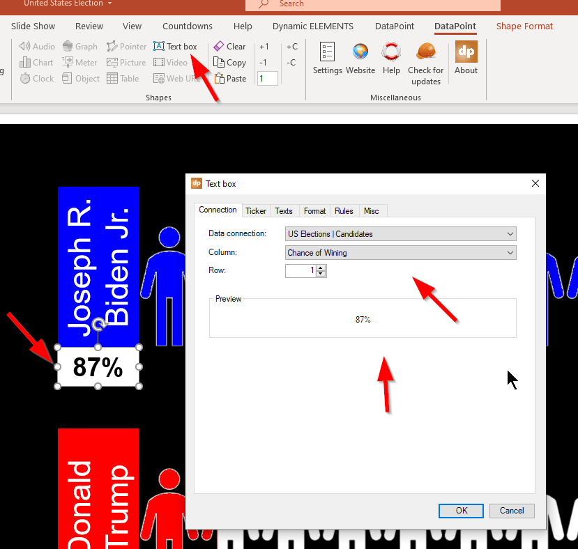
Now we go to each slide and connect each text box and picture to the live data that pertains to it. For example, here is a screenshot of slide 2 where we connect the text box under Joe Biden to the % chance of winning according to the poll data.
Other Option #1: Infographic
On slide #2, in addition to the live data text boxes showing the percentage chance of winning, we have also shown the percentage as an infographic. We duplicated a series of little clear people next to each candidate’s name, then added a rectangle with another color. We converted this color to a meter, using the [Meter] command in DataPoint, then set the scale from 0 to 1. The candidate’s percentages (87%/.87 and 13%/.13) then move the colored rectangles the appropriate distance.

Option #2: Picture Bar Chart
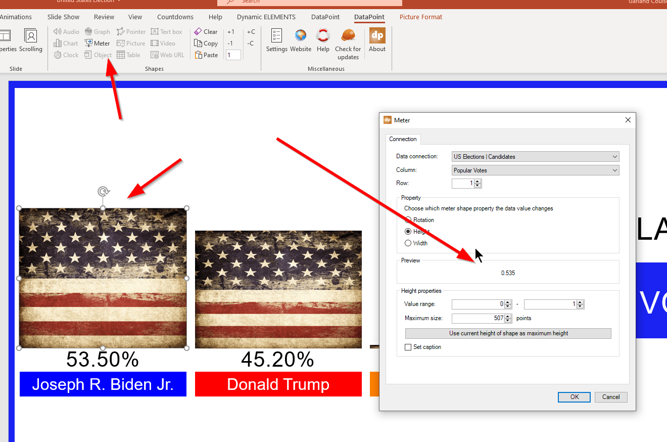
On the third slide, we have shown the poll popularity numbers as a bar chart using an old flag for the graphic to make it more interesting. Once again, we are connected to live data and are using DataPoint’s [Meter] command to turn the image into a meter graph.
Option #3: Tachometers
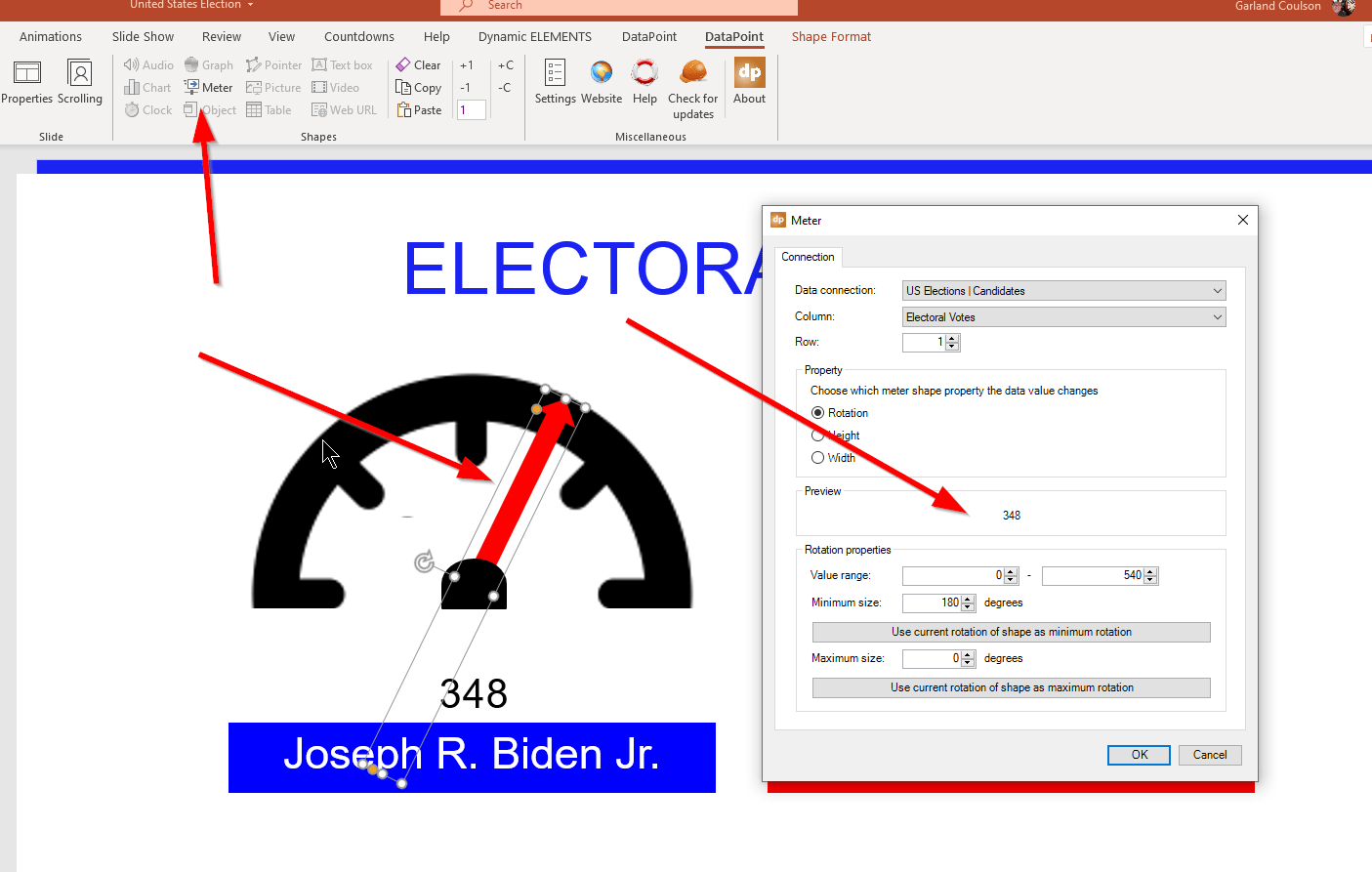
In this third option, we have used an arrow image to create a tachometer linked to data in real-time. This was accomplished by clicking on the arrow, then choosing the [Meter] command, then setting the rotation as a value between 0 and 540 electoral votes.
Then the arrow meter is connected the data number.
Option #4: Map Data
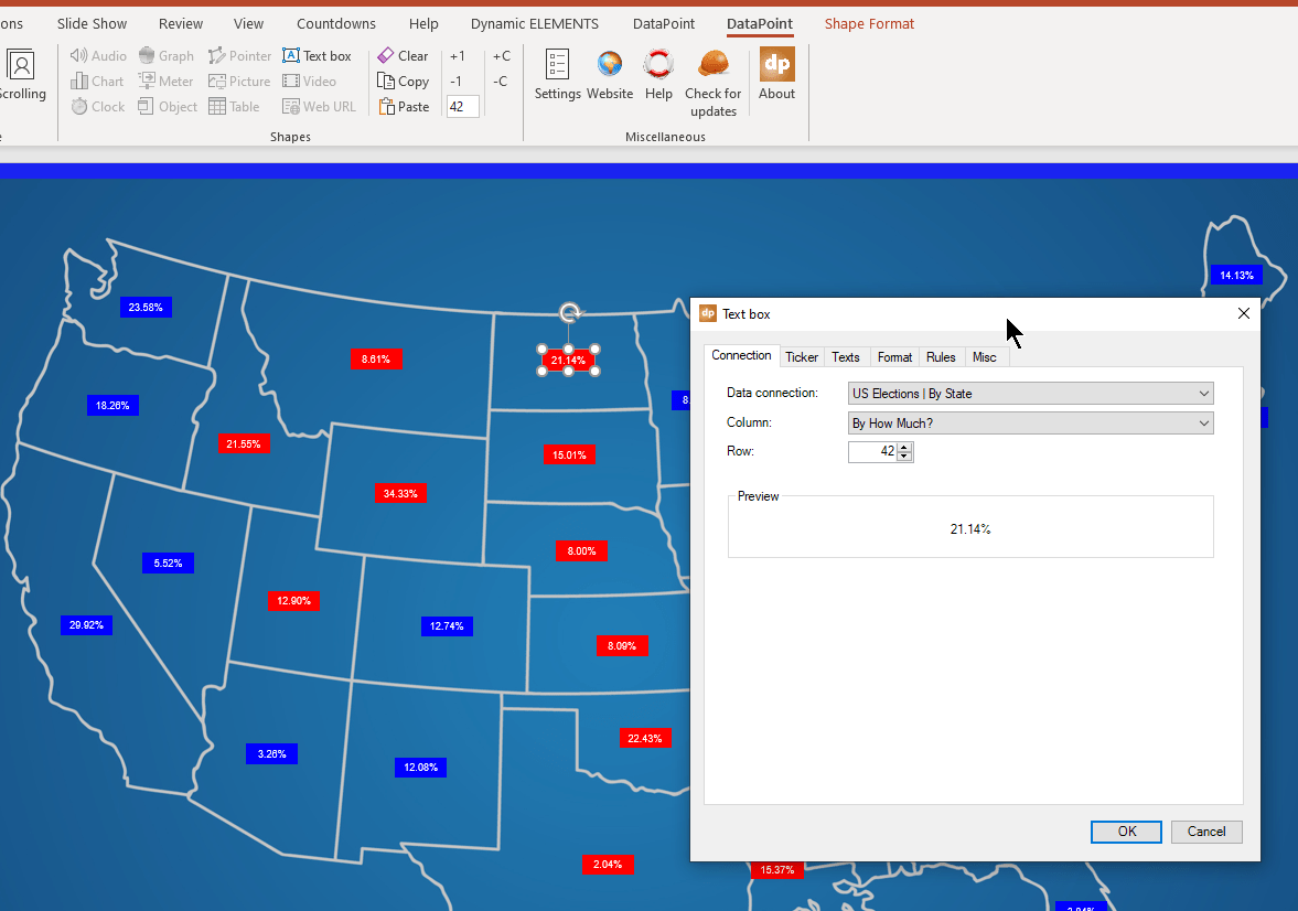
Showing the data on maps is a great way to connect people to the data. In this case, we added a simple text box to each state, then used the DataPoint text box command to find the data for each state. Once the data connection is made once, the data will update on the PowerPoint as new data comes in for each state.
Once again, we used the rules option for DataPoint text boxes to color the boxes based on which candidate was winning the polls in that area.
We hope you’ve enjoyed this how-to article and video. If you have any questions about how any of this was created, please contact us. You can download a free trial of DataPoint here.


