Today, almost all the reports you come across when handling work will be mostly data driven. So, it is important to have a good platform to design your reports attractively. The PowerPoint together with DataPoint can be used to make and produce amazing looking reports. This is a very efficient way of producing amazing looking reports which are actually very easy to do. DataPoint + PowerPoint = an amazing PowerPoint Report Builder.
Below is a step by step process on how to use PowerPoint along with DataPoint to create and design reports.
1. Open a New PowerPoint Report Builder Presentation
The first step would be to open a new PowerPoint presentation with text boxes of your choice. Here you can insert the gist of all the information to be contained in the report by using separate slides. The best text box would be the ‘portrait text box’ as it is considered the ideal shape for inserting information that is contained in usual reports.
2. Insert Textual Information
Begin designing your report by inserting textual information first and use bullet points to elaborate your analysis wherever necessary. However, always remember to keep your textual information short and precise so that your audience will not be distracted when you are presenting the report for them.
3. Prepare Your Data on a Database
This is the first step of creating a good looking chart. So, if you planning to include all the data into one main chart, the best suggestion would be to de-clutter it if possible. It is ideal to have few simpler looking charts than one whole complex chart that will confuse the audience. If there are any unrelated data in your database, try eliminating them or shifting them to a whole new tab for your convenience.
4. Connect Data through DataPoint PowerPoint Report Builder
Once you have got your database all ready for a chart, the next thing would be to link it to PowerPoint presentation software. Go to the PowerPoint menu and click on the DataPoint. In the DataPoint menu, you will find a category called the ‘connections’. Here you have to click the ‘list’ in this category and select the Excel file node. Then click on to the add connections button and then you are done connecting your data.
5. Link Your Chart to the Set of Data
Right after you have clicked on the excel node, begin browsing through the database files and select the one you wish to make a chart of. Then click the ‘add query’ button to select the active sheet and change the range to include all the data in the excel sheet. Thereafter, you can refresh interval to a time span of 1 second and click OK. This is where you will see the preview of the data that is ready to be included in the chart.
6. Insert a Chart to Your Slide
Before considering what type of chart you need to present your data driven report, insert an ordinary chart and check whether your data is displayed properly. It is very simple to do, and first, you have to go to the targeted slide where you want to insert the chart or pick a whole new slide. Then, click ‘charts’ in the illustration category in the insert menu. Here you can pick a chart of your choice and see whether it displays all the data properly.
7. Customise Your Chart
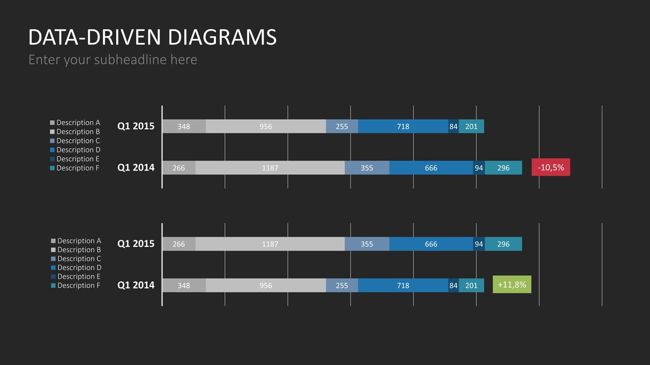
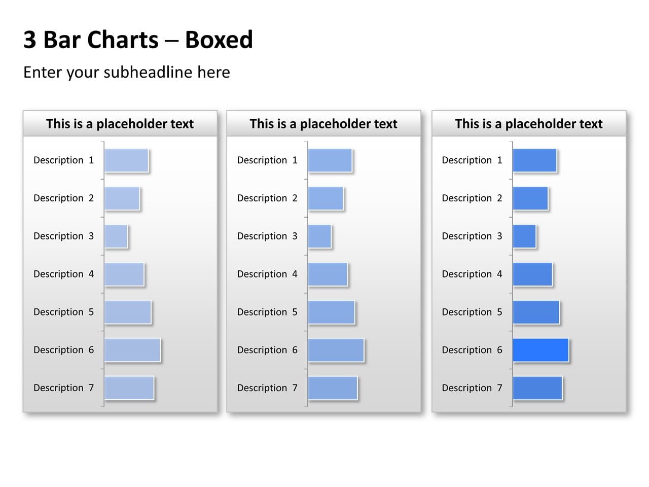
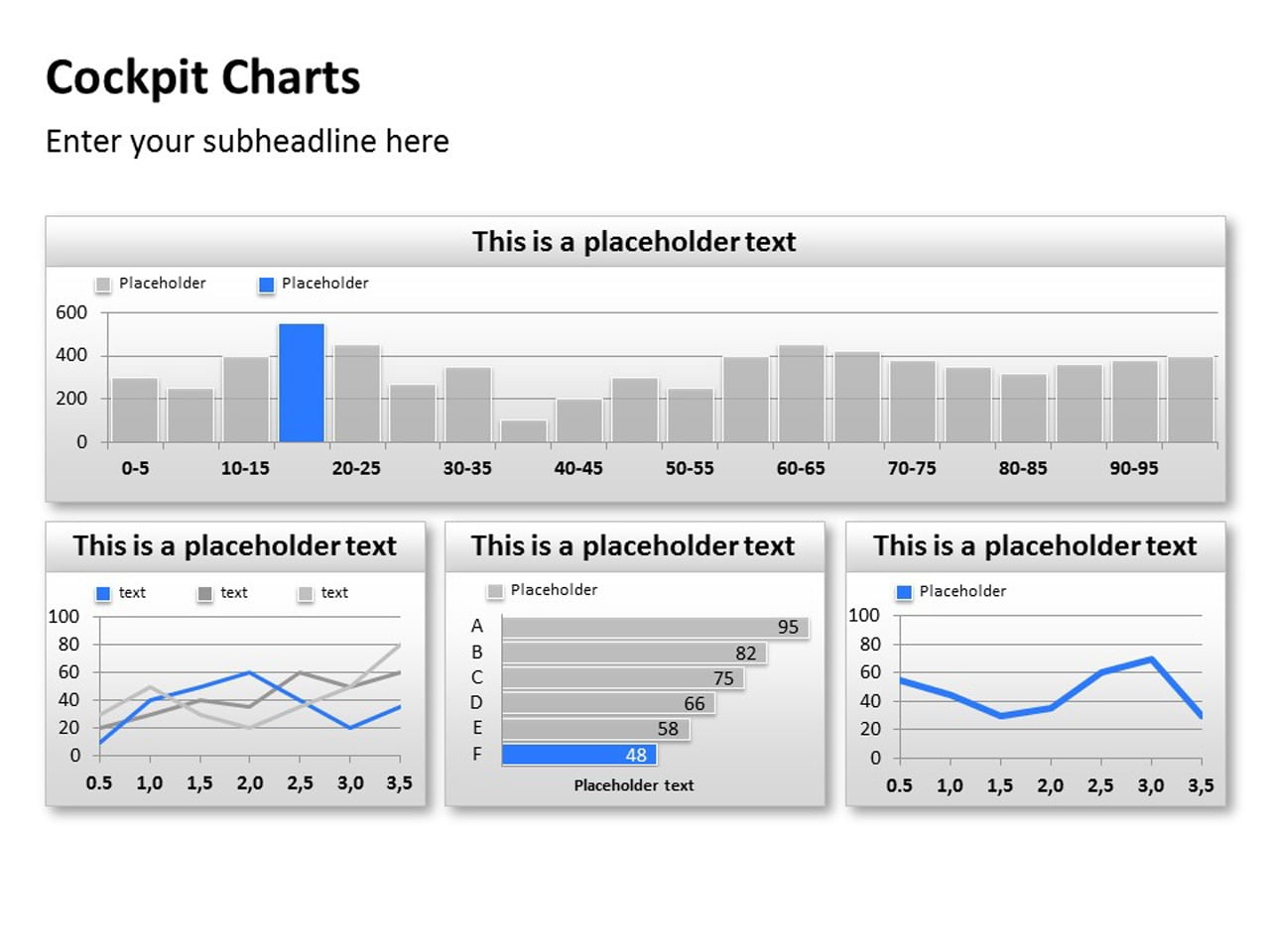
Charts are an important part of any report. They represent important data related to any kind of analysis reports. If the chart you have picked is what you want to present your data in, you can begin to customise it. Use different title, legend, and colours and make it appear more attractive to your audience.
8. Create Real-Time Charts
Add data-driven real-time charts to your PowerPoint Report Builder by linking the chart to the data query. To do this, select the chart that contains your data and then click DataPoint and select the chart from its menu. Finally, click ‘ok’ to link the chart to the DataPoint connection to make the chart completely data-driven. This will always keep this chart connected to the data source and updating it constantly over time.
9. Incorporate More Graphics for a Successful Report
Usage of few images and a vivid graphical representation of your data can be more evocative than an ordinary report stuffed with data. Remember to use bullet points more often and arrows to improve cohesiveness among data.
10. Generate Snapshot Presentations
This is perhaps the most effective tool found in PowerPoint to generate reports using the latest data. Go to DataPoint in the PowerPoint menu and click the snapshot button. This will generate new presentations updated with the latest data that is in your database. The advantage of this facility is that at the end of the generation of snapshot presentation, the PowerPoint software will automatically remove all the active links to the presentation leaving no trace for the people who receive the presentation of the report.
11. Use mail-merge
Mail-merging functionality in PowerPoint can be used to create multiple slides to create customised documents. This is done through using the snapshot presentations in DataPoint which has proven to be a very efficient way of reaching out to good clients. So it is not one single file for all clients but separate files for each person. What you have to do is to create multiple presentations that are personalised to fit for each client according to the data relevant to them.
Using DataPoint as PowerPoint report builder add-on software you can create appealing reports like never before. DataPoint has very efficient and unique features that will help you to get the best of this presentation software. You don’t have to worry anymore about out-dated data since DataPoint can get your database and the PowerPoint to collaborate smoothly.


