I admit! I’m addicted to digital signage and information screens. Everywhere I look, I see samples of information screens or scenarios where people better can use information screens to enhance businesses, processes, and flows.
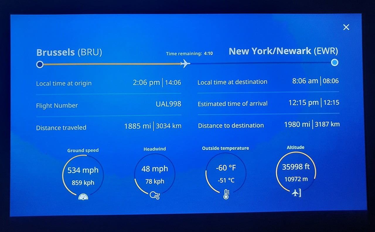
Even in the air when I recently flew from Brussels to our office in New York. I was flying in a brand new United Airlines’ Boeing 787-10 Dreamliner. I was looking at my flight progress on my in-flight entertainment screen, and thought, this could also be made in PowerPoint and made data-driven by our DataPoint plugin. OK. Let get started.
On the in-flight entertainment screen, we see mostly text boxes like the airport of origin, the airport of destination, flight percentage completed, flight number, time at origin, time at destination, distances and so on. Next to the many text boxes, we see a progress bar at the top and some 4 charts at the bottom of the screen.
Design in PowerPoint
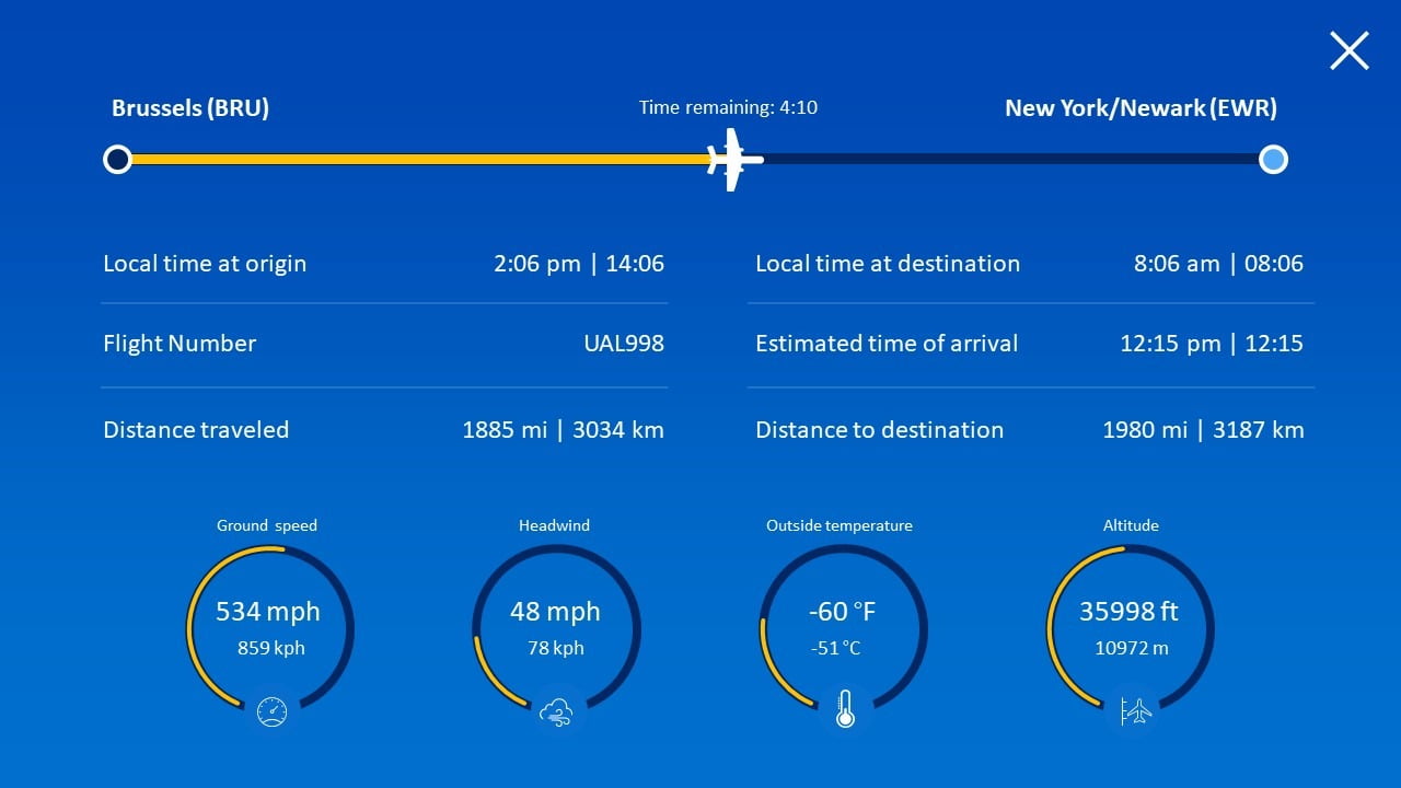
Piece of cake to design the same in PowerPoint and then use DataPoint technology to make this slide really data-driven.
Connecting to data source
Of course, we have no public access to this flight information in mid-air, but assume that we can get that information from a database or data service via e.g. XML or JSON. With DataPoint you can connect to some 25 data providers and get in the information in real-time.
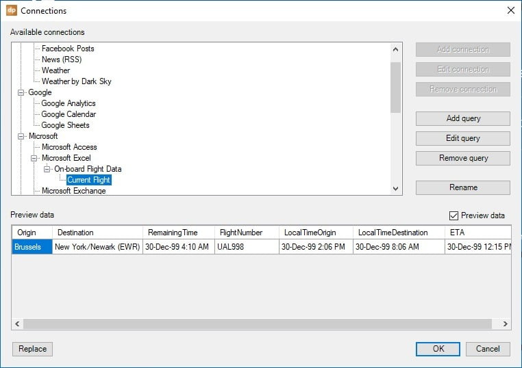
We simulated this data source with an Excel worksheet here. Make a connection to the file, choose the sheet, set the selection range and the data refresh rate. A preview of the data can be seen here.
Linking shapes
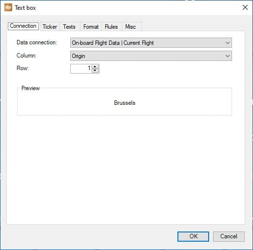
Then, insert a text box on your slide and have it selected. Then go to DataPoint and click the text box button. There set a connection to the flight information and select the data column that you want to show here at this text box. When this is dynamically linked, your data can be changed (automatically) at the data source and your linked data will be updated while the slide show is running. Click OK to bind this text box to your data column.
Continue to link the remaining text boxes to your columns.
For the flight progression, you can draw a yellow rectangle shape on your slide and have its length controlled dynamically by a DataPoint meter shape. A meter can visualize the progress based on the time info you have, or based on the distance to destination.
Use normal charts are bottom to visualize the ground speed, headwind, outside temperature and altitude. Link these charts dynamically with DataPoint to their corresponding values of the Excel data.
Ready? Run your slide show and see the data is updated in real-time on your screen. Use another computer to simulate flight progress data updates. In real-life, this data would come in automatically. Here we have to simulate updates.
Do you want to explore this DataPoint plugin? Try it out for free. Sign up here.


hi, i was wondering how you actually made that information screen in powerpoint. it would be really helpful if you can show mw how. thanks
Hi Yousef. Yes that presentation was completely created in PowerPoint. Are you interested in that PowerPoint design only, or do you need it to be dynamic (linked to data)?