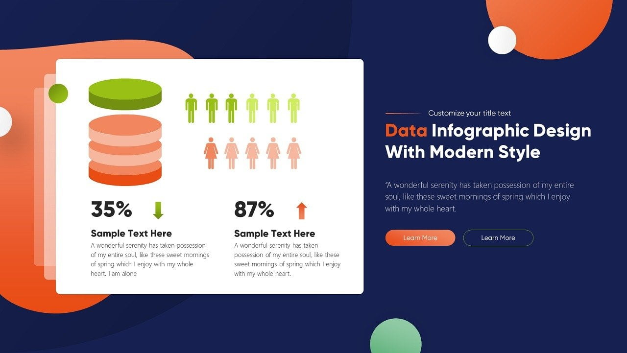
Data visualization is something that many people never think about. We’re so busy consuming the data that we don’t even realize we’re doing it. If you are unaware that you’ve been consuming data, that means those responsible for data visualization are doing their job right!
There are several programs out there for data visualization. They can be good, but sometimes cost prohibitive and inconvenient. Luckily, data visualization on PowerPoint can be slick, beautiful, and effective.

Here are 16 reasons to do data visualization on PowerPoint:
1. You probably already have PowerPoint on your computer
The first reason is simple: pure convenience. Most computers already have access to PowerPoint. If you’ve been to college or university within the last 15 years, you probably have a working knowledge of PowerPoint to begin with. Plug-Ins have been designed specifically to assist with real-time visualization from Excel data to PowerPoint.
2. You can design your own slides or use templates
Data visualization in PowerPoint means versatility. With PowerPoint, the user can design slides based on their needs, and if they have the ability. However, that’s not all they can do. They can also use pre-made templates, if they don’t have the ability or desire to create their own slides. This, again, points to the convenience of using PowerPoint for data.
3. Sharing is easy
What’s data without a simple way to share it? The ability to save your data visualization projects in multiple different formats is essential to be able to demonstrate presentations. With the ability to save projects in pptx, images, pdf, or mp4, PowerPoint is an incredibly user friendly way to present data. Think of it this way: you’ve got a big presentation. Because of corona-virus, everyone is now working from home. With the combination of Zoom and PowerPoint, you can deliver that presentation just as you would at the office. Because of the multiple format options, no one gets left out. No headaches.
4. Interactive dashboards
Data visualization should leave the audience wanting more. If this is the case, the presentation itself is super successful. PowerPoint allows for a completely interactive experience for the user. The ability to create stunning interactive dashboards, allows for a more tactile presentation. Each presentation can be interactive while having multiple slides, and easy navigation through buttons with hyperlinks. Link to reference material, online shops, studies. All within PowerPoint.
5. All your data. In one place.
The world is filled with data. 2.5 quintillion bytes a day are generated. With this, many different programs and databases exist to store it. The beauty of running your data visualization through PowerPoint is the ability to conglomerate this data. PowerPoint allows you to link data from multiple different sources in one clean presentation, and allows for real-time adjustment and updates of this data.
6. It’s a natural fit
Microsoft developed an awesome array of tools. Word, Excel, and PowerPoint all have their unique capabilities. Word has been the standard for presenting text information for a generation. From professional writers, to students, to grandma’s typing letters for Christmas cards, Word is ubiquitous.
Excel is a beautiful tool in its own right. While many of us dread reading, and plotting data points in Excel spreadsheets, we can’t deny its incredible usefulness. Nothing else compares for quick and seamless calculations.
Just like Word and Excel, PowerPoint has a unique talent: It presents the information created by tools like Word and Excel is an aesthetically pleasing, digestible format. PowerPoint has the wonderful ability to take boring or stale data points, and make them consumer-friendly. Data visualization is an art-form. When done properly, it combines form AND function, to simply and beautifully present data.
7. Local reporting
When you hear the words “local reporting”, you may think of the weatherman on the scene of a hurricane, his umbrella blown inside-out. When talking about data visualization on PowerPoint, local reporting is something completely different. Local reporting means that the data you are presenting does NOT go onto the cloud. For those sharing sensitive data, this is paramount. The ability to share and store data locally, while old technology, is still the best way to get the job done securely in many cases.
8. K.I.S.S.
Keep It Simple, Silly! We’re not all Steve Jobs when it comes to technology. In fact, most of us are more like Fred Flintstone. Guess what, THAT’S OK! There are still technologies that are user friendly out there! Thankfully, for the world of data visualization, PowerPoint is one of them. With very little technological know-how, someone can create beautiful data visualization projects of their own design, or using templates. PowerPoint has the ability to make the novice look like a PRO. The successful people often tell us “fake it ‘til you make it”. With PowerPoint, you won;t even need to fake it. The simplicity of the program allows just about anyone to deliver a high-quality project.

THE BEAUTY OF POWERPOINT PLUGINS
One of the cool things about PowerPoint that often gets overlooked, is the multitude of useful plug-ins that have been created for it. The plug-ins enhance the already-awesome capabilities of the program. DataPoint is one of those amazing plug-ins.
DataPoint is a cool plug-in that seamlessly, and instantly transfers data from Excel and other data sources, to PowerPoint. That means, once linked, boring Excel data is transferred to an exciting, and visually appealing PowerPoint presentation. DataPoint is linked to 25 different databases so it ensures the information is completely up to date, always.
In this time of COVID-19, a stark realization humanity has made is that we NEED access to up-to-the-minute data. Whether it’s the number of confirmed cases at your local hospital, or the number of masks your local factory is producing relative to the amount needed.
Here are some other cool advantages of using PowerPoint, specific to the DataPoint Plug In.
1. Seamless data integration
No need to export anything. DataPoint easily and reliably syncs your Excel projects, as well as many other databases, to PowerPoint. This makes PowerPoint, an already simple tool, even simpler! You’ve gotta love that. Anything that can simplify the way we produce and share data is brilliant.
2. No more typos
Let’s face it: typos are ugly and unprofessional. DataPoint, due to its seamless integration with PowerPoint, ensures that no typos will be in your presentation. As simple as this seems, typos can be a make or break factor in a presentation. We’re meant to TRUST the data that we’re seeing on screen. With typos, the data seems like it may be coming from an unreliable source. DataPoint fixes that problem.
3. Fresh data
DataPoint instantly refreshes the data in a PowerPoint presentation upon opening. This means the second that info is placed on the screen, the info is completely up to date and accurate.
4. Continuous refreshing
Even when your slideshow is running, DataPoint refreshes it continuously! The beauty of this is that it’s a completely hands-off process. No need to restart the program. Continue pumping out those beautiful slides you worked so hard on, while keeping the info fresh!
5. Mail merging
Mail merging can be an underappreciated feature of DataPoint. Once you recognize the beauty of mail merging to create multiple unique slides, for any individual recipient, it’s a game changer.
6. Presentation generation
DataPoint is also a wonderful way to generate presentations based on the data it receives. Again, this adds a level of simplicity, and a hands-off experience to the user. Automation and creation, when combined, is an amazing way to do business!
7. Dynamic rules and conditions
Some data visualization methods and programs are bogged down by rigid rules and conditions. With DataPoint however, there are a ton of flexible and exciting ways to get your info across!
8. Affordable subscriptions
Lastly, but CERTAINLY not least; DataPoint has SUPER AFFORDABLE subscriptions. With the myriad of ways DataPoint is going to simplify your life, we feel it’s an easy decision.
If you’ve never tried using PowerPoint for data visualization, or were unaware of its many capabilities, it’s time to give DataPoint a try!


I love data visualization and can recommend the DataPoint PowerPoint Addin to anyone creating recurring reports with PowerPoint.
Great to read Tom!!